The Tipping Point
Every project—and I'm not exaggerating, EVERY project—that I have ever worked on and probably ever will work on has a sort of tipping point moment. This is when my thoughts about the project go from “How on earth am I going to fill all these pages with words?” to “How on earth am I going to fit all my ideas into these few pages?” This might be more of a psychological matter than a design one, but it’s true nonetheless.
I just reached that point for my current design project, The Darkest Woods. If you’re familiar with The Darkest House, this is a standalone follow-up to that product. I’m not going to give you the sales pitch here for it. You can get that elsewhere.
The facts behind the tipping point in question are actually a bit of an illusion. I mean, we’ve already met a stretch goal to increase the size of The Darkest Woods, and if the length was really a difficult issue, we could do another one. (And who knows? Maybe we will.) Here’s the real secret, though: to a point, that way lies madness. If given the chance, plenty of designers will just keep adding pages (or shrinking the type, narrowing the margins, etc.), maybe forever. Or at least, until they’re just forced to stop. I’ve seen it happen.
And on the opposite side of the issue, if for some reason you find you can’t fill the pages you need to fill, you can use all the opposite tricks: fewer pages, bigger margins, etc. (I suppose—I’ve never actually seen this one happen. Designers tend to overwrite, not underwrite.)
A Digression
Talking about this stuff, on one level, is a true behind-the-scenes peek into the mind of a designer dealing with deadline pressure, quality anxiety, and so on. But on another level, it’s bullshit. A good designer doesn’t use font size and page count to modify their workload or their ability to meet the deadline. It’s like what Galdalf says, "A wizard is never late, Frodo Baggins. Nor is he early! He arrives precisely when he intends to.” A game designer should apply this to page count. A good designer understands that any game product they design should be exactly the size and length it needs to be to convey the information and no more or less.
Changing the font size, shrinking the margins, and so on, are tools to enhance the usability of a product, or the appearance, not affect how much the designer needs to write. These things must fit the product every bit as much as the rules. For example, The Darkest House (and The Darkest Woods after it) are intentionally less text-dense than, say, a Numenera product, because they are just as much about flavor and mood as content, and the necessary rules are far less intensive to achieve the desired game experience, both in reading and in play.
The Real Effect of the Tipping Point
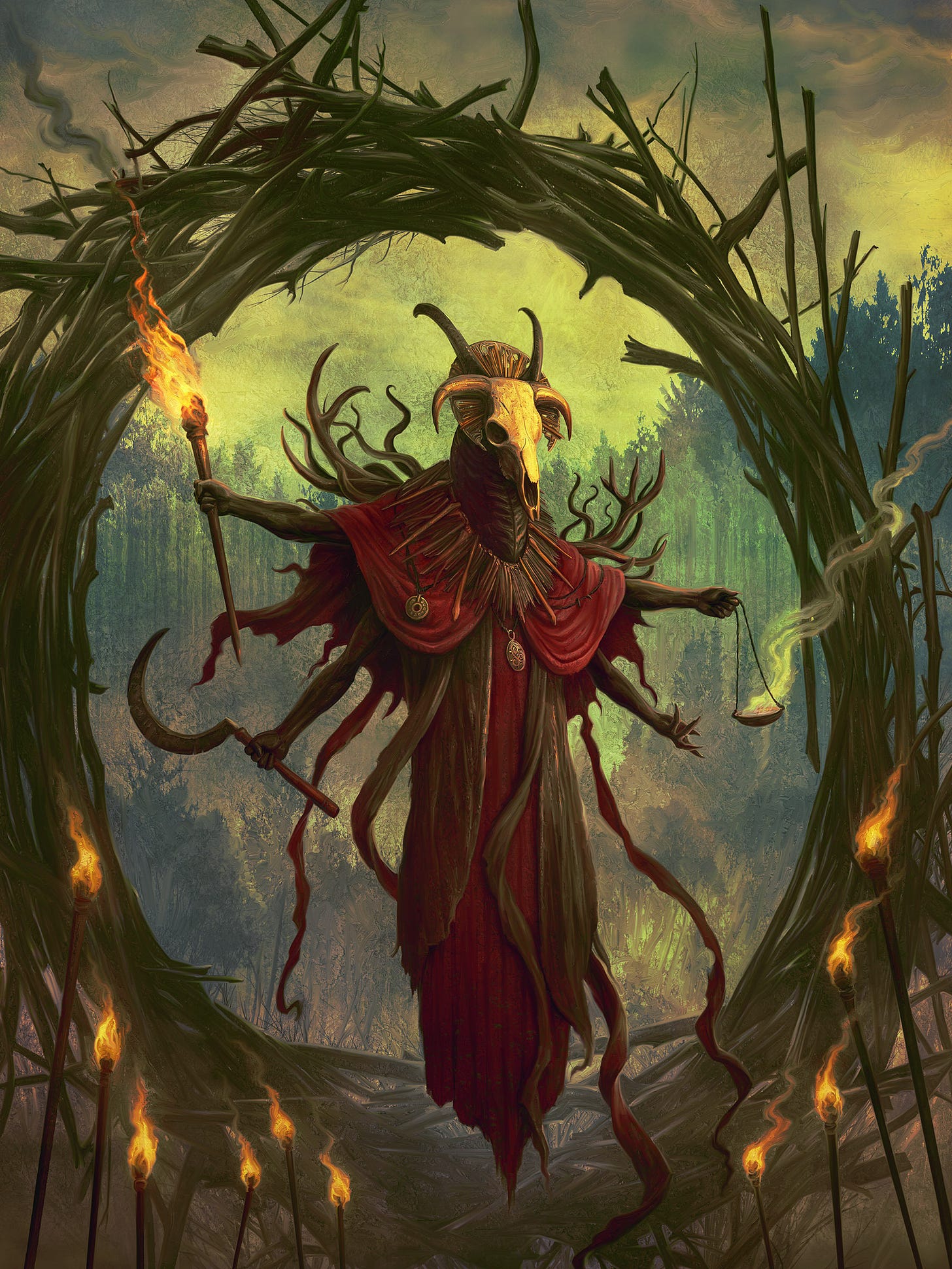
Reaching the point in the process where it’s not about page count—where it’s not about limitations—doesn't mean that the project is easier from here on out. Seeing the proverbial light at the end of the tunnel isn’t a reason to breathe a sigh of relief. On the contrary, the project usually becomes harder from that point on, because it's no longer just writing whatever the hell I want, however I want, but writing to specifications. Unfettered writing is easier and faster than constrained writing, and the latter half of the project is not only constrained by mundane things like page count and deadlines (such things are feeble foes and easily overcome) but by the guidelines that I've created for myself in the unfettered writing stage. For The Darkest Woods, such things include how each witch is presented and how they make themselves known. Since the witches sort of control the flow of events in the woods (think about how/when “The House Acts” in The Darkest House), they can’t be presented just like any NPC, and yet they are NPCs and have their own goals within the context of the Woods. And yes, I mean beyond just tormenting the PCs.
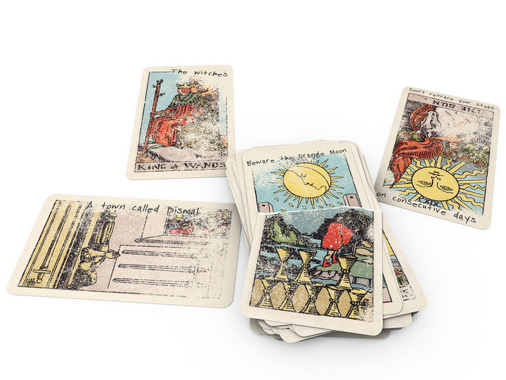
The latter half of the design of The Darkest Woods is also made trickier due to how every encounter area is presented, with precise requirements of description, links to other areas, use of the map(s), and any and all special tools for the GM, like physical handouts, pre-written direct messages to be sent, and more. Further, there are the numerous threads that connect the areas, like the mysterious symbols on the trees and oddly shaped trees (all of which the players will eventually discover have precise and important meanings). And lastly, like The Darkest House, the woods require a complex design of what someone recently described as the “environmental storytelling,” involving intriguing and informative clues scattered about, often in the form of journal pages, letters, and even tarot cards with important but cryptic notes written on them. The Darkest Woods adds to that with numerous audio cues and clues. Organizing and presenting these things is neither random nor simple and requires a detailed analysis of all the ways one can proceed through the woods. Even more than The Darkest House, the woods are not at all linear.
Of course, that means—as in any good “dungeon” design—that some encounter areas will get a lot of repeat traffic, which means they carry a lot more design/narrative weight than a simple dead-end area that will get visited once. In The Darkest House, this is where a lot of moving parts (the family entities, the tools, the keys, the Eyes of the House, etc.) came into play, one way or another. The house, as a product, had a lot of moving parts. The Darkest Woods has more. It's a complex design.
Every project has its own needs, and those needs make themselves known before the designer reaches the tipping point, but the needs have to be met after the tipping point. In many ways, the first part is just unfettered creativity, but the latter part is where the real design work gets done.


